 I recently designed this illustration for an Insurance magazine. It was for a story on fraud, and how to identify shady employees. Without wanting the illustration to be literal in reflecting wrong doings, I came up with a take on the 'wolf in sheep's clothing' idea. The sheep skin is obviously a fake cloak in comparison to the definite edge of the dark wolf. I created the sheep's wool from fingerprints to indicate leaving a trail and getting caught (getting fingerprinted). I like how graphic the illustration looks in black and white.
Wednesday, October 14, 2009
A wolf in sheep's clothing
 I recently designed this illustration for an Insurance magazine. It was for a story on fraud, and how to identify shady employees. Without wanting the illustration to be literal in reflecting wrong doings, I came up with a take on the 'wolf in sheep's clothing' idea. The sheep skin is obviously a fake cloak in comparison to the definite edge of the dark wolf. I created the sheep's wool from fingerprints to indicate leaving a trail and getting caught (getting fingerprinted). I like how graphic the illustration looks in black and white.
Labels:
Illustration
Thursday, October 8, 2009
Seventeen (magazine) in the 50s
 A while back, I found a 1957 January edition of Seventeen magazine at the 50s fair in Sydney. The illustration styles, fashion spreads and fabric patterns, made my decision to purchase easy.
Flicking through the magazine I'm enjoying the differences between editorial illustration – with it's looser line work and off register colour blocks – and fashion illustration – which is a literal interpretation of the clothing pieces, and the models (example above). Cool Daddio!
The spread below is about the "High-flying fashion" of the "Blouson look". In this illustration, it's all about the air mail colours.
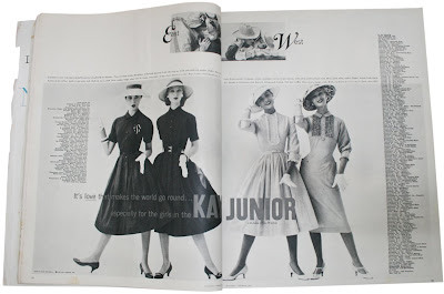
 An advert for Kay Junior, a division of Kay Windsor frocks (below). It seems crease resistant washable cotton makes you see double. This spread used photography.
 The red hatched apple illustration is from an article called "Schnitzing Party" – Eight teens tell about a party based on old Pennsylvania Dutch customs.
Labels:
Influences
Subscribe to:
Posts (Atom)
