Monday, December 21, 2009

Holy Flamingo – It's Chrismas!

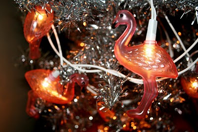
In less than a week Christmas will be upon us, in all it's FEASTive glory. It's been a busy end to the year, as I've been trying to finish up a long list of projects. Pictured above is my decorative offering for Christmas – a silver tinsel tree with pink flamingo lights. Very traditional.

One thing I love about this time are the Christmas lights and how they bring people together. Family and friends walk the streets pointing their fingers at houses, saying hello to family and friends as they dribble on an ice cream from Mr Whippy. Now that's the Christmas spirit.
Merry Christmas.
Thursday, November 5, 2009

Vertical Farming

This illustration was created for a Vertical farming story. Cities are running out of space and we can't rely on weather conditions any more – the answer, indoor hydroponics that scale the internal walls of tall buildings.

I drew comparisons between the repetition of vegetable crops growing up walls and the repetition of graphics in wallpaper designs – also used indoors. I wanted the vegetables to look like a print, so I simplified their characteristics and placed the colours off register.

I have been looking at a lot of deco patterns recently, which influenced the way I designed the strawberries.

Wednesday, October 14, 2009

A wolf in sheep's clothing

I recently designed this illustration for an Insurance magazine. It was for a story on fraud, and how to identify shady employees. Without wanting the illustration to be literal in reflecting wrong doings, I came up with a take on the 'wolf in sheep's clothing' idea. The sheep skin is obviously a fake cloak in comparison to the definite edge of the dark wolf. I created the sheep's wool from fingerprints to indicate leaving a trail and getting caught (getting fingerprinted). I like how graphic the illustration looks in black and white.

Thursday, October 8, 2009

Seventeen (magazine) in the 50s

A while back, I found a 1957 January edition of Seventeen magazine at the 50s fair in Sydney. The illustration styles, fashion spreads and fabric patterns, made my decision to purchase easy.

Flicking through the magazine I'm enjoying the differences between editorial illustration – with it's looser line work and off register colour blocks – and fashion illustration – which is a literal interpretation of the clothing pieces, and the models (example above). Cool Daddio!

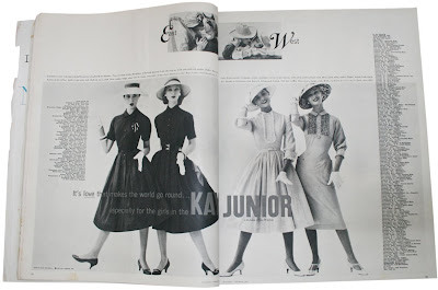
The spread below is about the "High-flying fashion" of the "Blouson look". In this illustration, it's all about the air mail colours.An advert for Kay Junior, a division of Kay Windsor frocks (below). It seems crease resistant washable cotton makes you see double. This spread used photography.
The red hatched apple illustration is from an article called "Schnitzing Party" – Eight teens tell about a party based on old Pennsylvania Dutch customs.

Wednesday, September 2, 2009

Silk Ikats & (not so) old lace

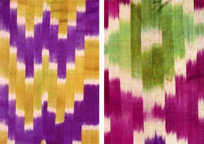
The Art Gallery of NSW is exhibiting Silk Ikats from Central Asia. An Ikat pattern is made of silk and sometimes with cotton too. It is created by binding and dying the threads before they are woven into a textile. Uzbekistan was well known for it's ikat design, these were created by women and were worn as a symbol of status and wealth. After learning about the time consuming work that goes into making these, I could understand why they were so valued.

From a distance the patterns look strong, and definite, but as I got closer I could see the edges were misaligned, with threads of different colours poking out oddly. My favourite patterns (above [©IAMM Museum shop]) had a more geometric design, but curvy motifs of flowers and in particular, almonds, were more common in the exhibition.

Vintage looking lace
On a different note, I collected some laces and ribbons from the Stitches and craft fair, they should make some nice details in some up-&-coming illustrations.

Thursday, August 27, 2009

Blogging my bobby socks off

Last weekend the rockin' 50s fair was held at Rose Seidler House in Wahroonga, Sydney. The house – built in 1948 by Harry Seidler – is an icon of modernity. The grounds were filled with 50s clad kats who had come to celebrate the fashion, the music and the architecture of the 1950s.


There were stalls selling memorabilia, anything from clothes to needle holders. This kept me busy for hours. Here's some of my favourite pieces:

Monday, August 24, 2009

Seventeen (magazine) in the 50s

A while back, I found a 1957 January edition of Seventeen magazine at the 50s fair in Sydney. The illustration styles, fashion spreads and fabric patterns, made my decision to purchase easy.

Flicking through the magazine I'm enjoying the differences between editorial illustration – with it's looser line work and off register colour blocks – and fashion illustration – which is a literal interpretation of the clothing pieces, and the models (example above). Cool Daddio!

The spread below is about the "High-flying fashion" of the "Blouson look". In this illustration, it's all about the air mail colours.An advert for Kay Junior, a division of Kay Windsor frocks (below). It seems crease resistant washable cotton makes you see double. This spread used photography.
The red hatched apple illustration is from an article called "Schnitzing Party" – Eight teens tell about a party based on old Pennsylvania Dutch customs.

Saturday, August 22, 2009

I'm in stitches

Today I popped in to the Stitches and Craft show in search of fabrics and odds and ends (www.stitchesandcraft.com.au). Amongst the many traditional scrap booking and patchwork stands was a new area called Incubator, where contemporary designers could show their wears. The were some great hand made fabric prints, stationery, knits and jewellery to buy. Simple shapes and patterns printed in one colour on a neutral coloured fabric were selling really well.

After walking the three levels a few times, It's time to sit down, rest, and start riffling through my purchases.

Wednesday, August 5, 2009

Capertee


Well, it has been a while since my last post. I would like to thank some home renovations and a country break for occupying my time for the past month or so.

The cabin was in a top spot, and I mean a TOP spot, looking across the Capertee Valley. The winter weather gave the landscape some spectacular colours and light.

The photo above was taken from the cabin. I love the carpet like texture of the rolling hills and the curvy bark pattern on the tree. It's time to get drawing!

Thursday, June 11, 2009


Since my last post, I've been patrolling areas looking for subjects that I think will work well as an illustration sequence. I would like to include a scene with water, so I set out to Elkington park in Balmain which overlooks the harbour. Above are a couple of photos I took recently. I set out at 8.30am, 12.30pm and 4.30pm to capture the different lighting conditions.

Today I am off to Turon, near Mudgee. Hoping to get some country scapes with a mountain goat.

Monday, June 1, 2009

Me and Monet

While working on my landscape illustrations, I have been revisiting some of the landscape artists I studied years ago. Claude Monet and the Impressionists (mid 1800’s) have always struck a cord with me. I am particularly drawn to their use of colour, light and textured brush strokes.

A couple of years ago I visited the Neue Pinakothek Art Gallery in Munich. The gallery was exhibiting one of Monet’s artworks from the Water Lilies series. I stood in front of it for a long while, I got a bit lost in the texture of the brush strokes... I’m sure I could almost hear the water.

I have been inspired by Monet’s obsession with the outdoors and the effects of weather and light on a subject. A great example of this is his painting series Haystacks. The idea of doing a series to reflect the change in conditions is something I would really like in incorporate in my Sydney landscape illustrations.

Unlike Monet, I’ve been visiting different locations armed with my camera to capture the lighting effects on a number of subjects, rather than taking multiple canvases out to the fields for hours or days. I’m pretty excited about this project, I’ll publish more as I go.

Thursday, May 14, 2009

First landscape

I created this illustration for two reasons.
1 – A friend who I used to work with in Balmain recently moved overseas. She was looking for something that she could hang on her wall to remind her of home.
2 – I wanted to see if I my use of fabrics and textures could be used to illustrate a landscape.

Balmain has many old buildings with interesting detail in the features... it would do nicely as an Australian street scene.

I spent an afternoon searching for the right composition, and the right feel (Australian).

From there I worked up some sketches and outlines to follow.

Added some fabric for colour, texture and shadow – I ended up using several parts of my brown vest to create some of the shading on the building.

And used some water colour to lighten the density of the fabric knits, and create some distance.

After doing this project, it has spurred me on to do more landscapes like it. I'll keep you posted.

Wednesday, May 6, 2009

Fab fabrics

I am always looking for new textures that I can use in my artwork. Often times I use what ever is in wardrobe, or the craft basket. Using the natural folds and creases in the materials can add to the perspective of the illustration, it's fun to work with.

Tuesday, May 5, 2009

Street inspiration

Ideas for my illustrations usually come from what's around me. This could be signage, textures, patterns, colours, lighting, shapes on building, or what ever I pass on the street.

On a Sunday wander, I took some shots of what interested me.

Monday, May 4, 2009

It's all new to me

Well, here it is... my first blog post.

Being from a print publishing background, I haven't ventured much into the online world. But, I thought this could be a good way to share my illustration work, and the processes I go through to get to my final artwork.

At the moment, I am interested in illustrating landscapes. Check out my gallery page for my most work of a street scene in Balmain NSW.

I'm hoping to scout some new places around Sydney on the weekend. I'll post some of the images on the blog. This is where it starts.

In the mean time have a look at my gallery for samples of my other work.

Published illustrations


Gallery